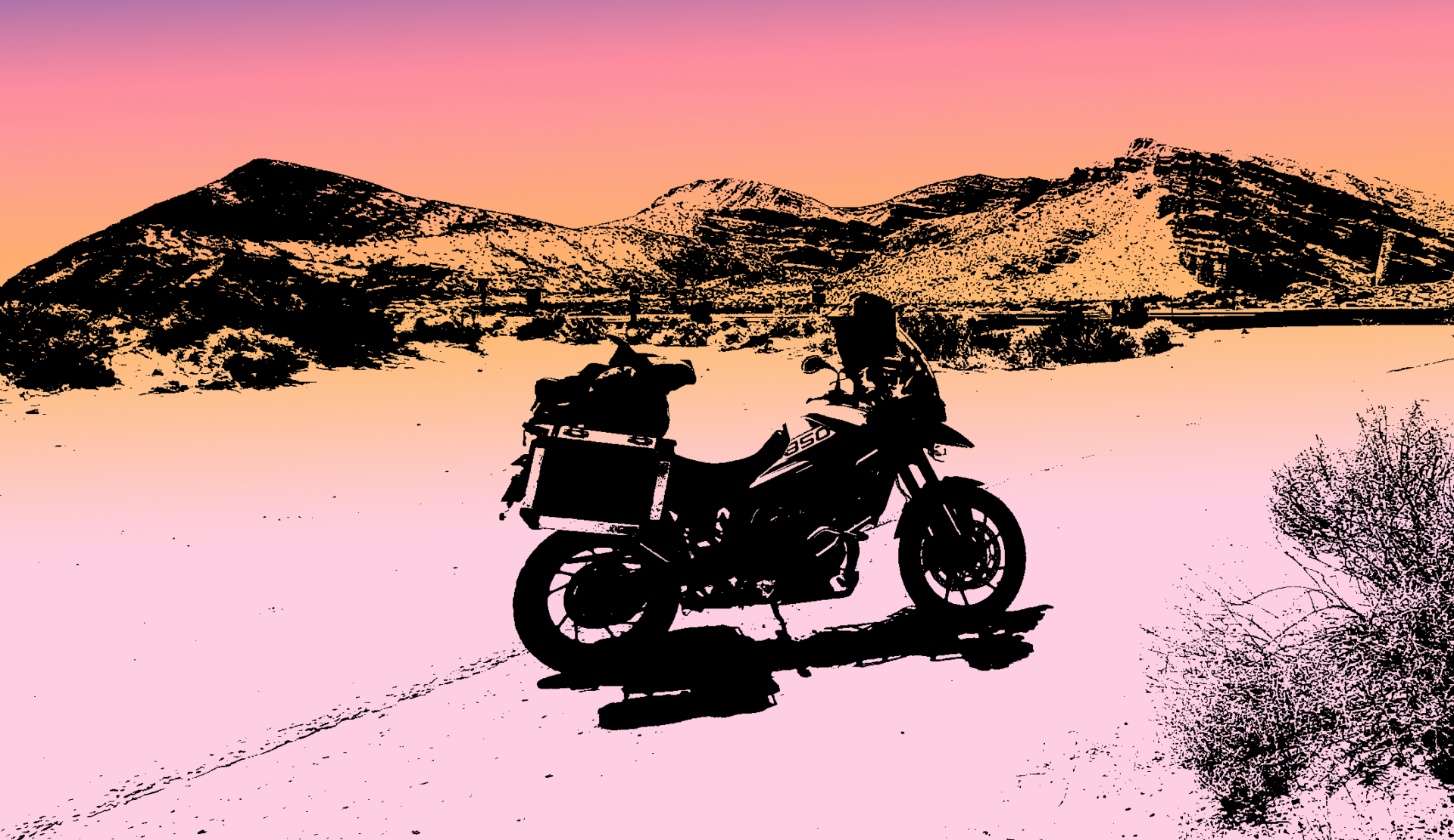
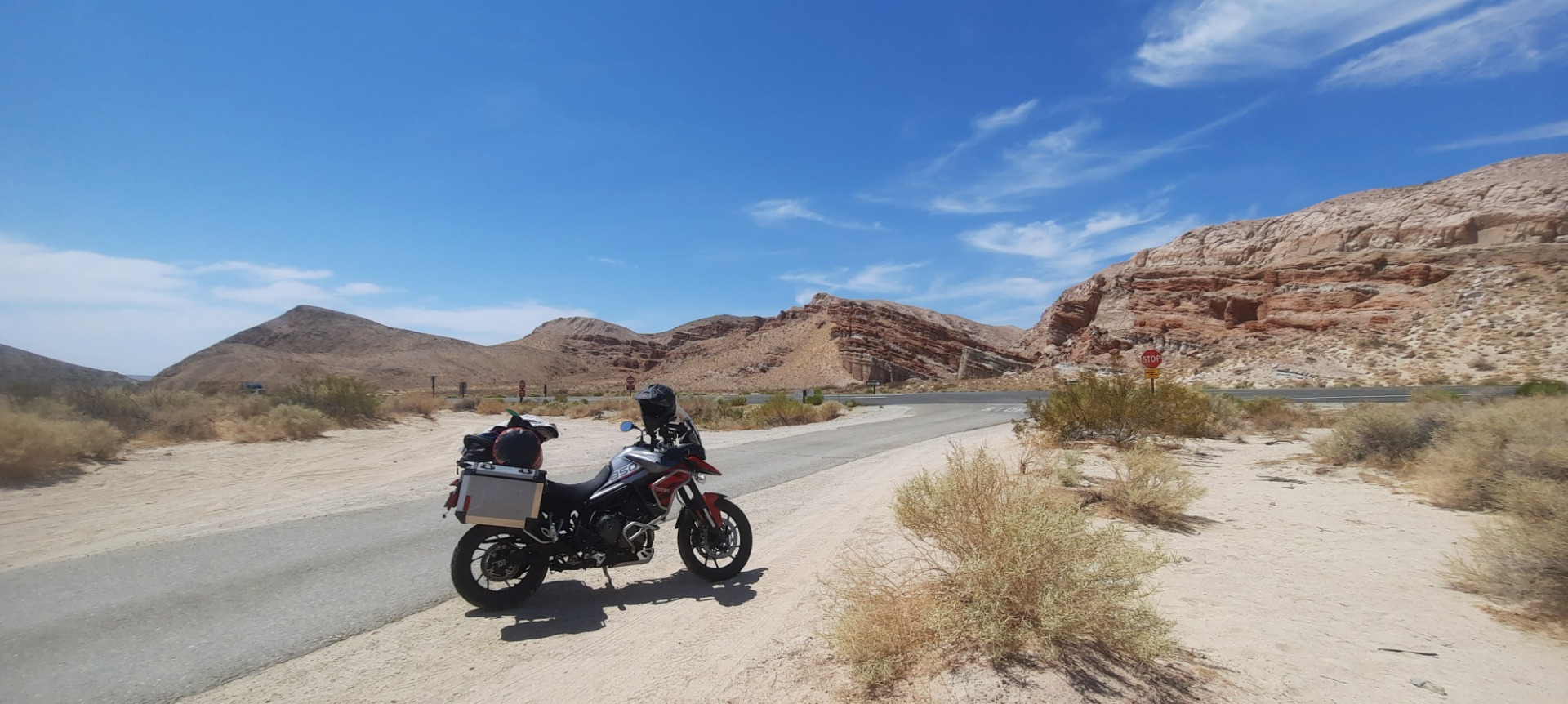
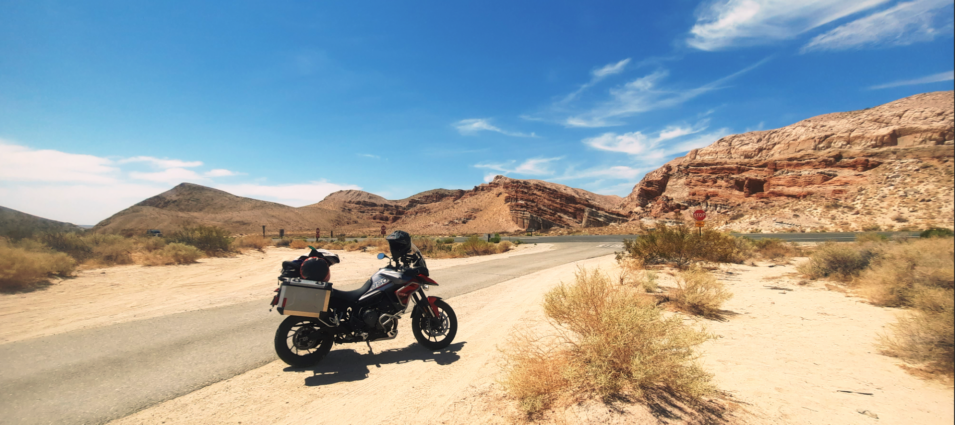
This morning I was prepping for my digital photography class I am teaching this afternoon and was brushing up on more color grading techniques. Along the way I ended up playing with a THRESHOLD adjustment layer that took this image I made of my motorcycle just outside of Death Valley a couple of summer’s ago look like the cover of the movie The Endless Summer.

It’s interesting how cultural elements seep subconsciously into my work. I hadn’t planned to create this image and it wasn’t until I stopped playing with it that I realized I had basically the same color palette of orange and magenta that the original movie poster had.
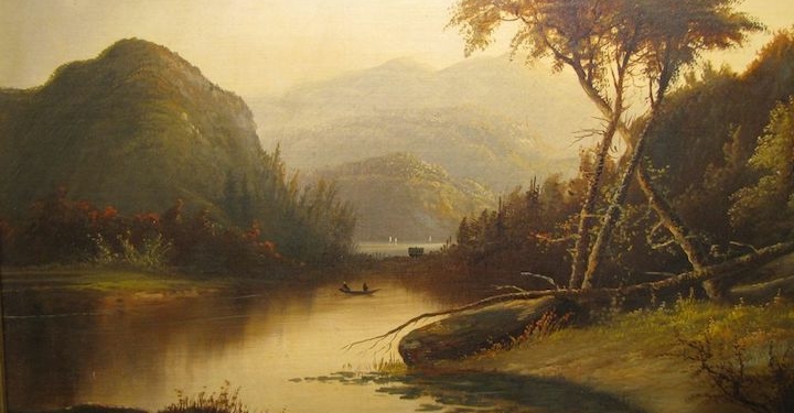
The starting path of all this was to explore how I might color grade a photograph based upon a painting. I was looking at how I could take the color palette from a Hudson River School Painting and apply it to my own photograph. Here is the image I researched for building my color palette.
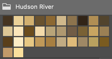
In Photoshop I could reduce the painting down to 32 colors and save it as a color swatch that I could then load into my image. Here is the before and after.
I think the process of interpreting color based upon historic landmarks and paintings can offer important creative options for a photographic artist. I look forward to doing more experiments with these techniques.
