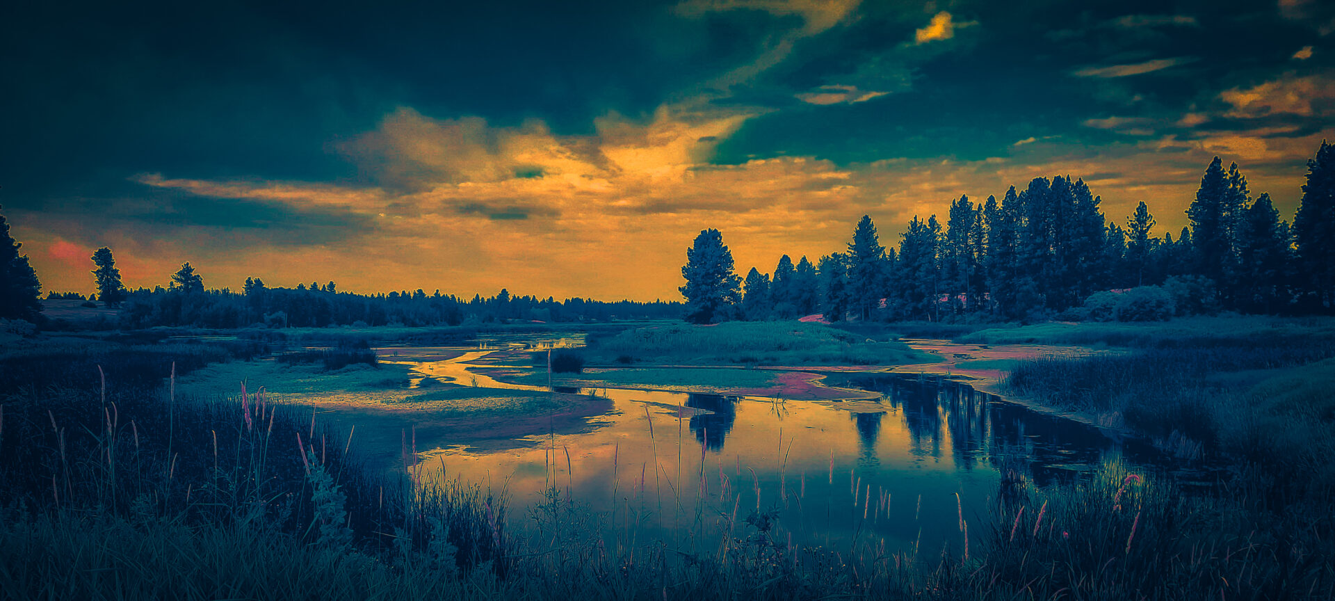
Today I was giving a color grading demonstration in my Digital Photography II class. Color is the way we can translate emotions into photographs. By starting out with a high fidelity image, I can then apply complimentary color harmonies via a wide range of techniques that enable me to transform the image dramatically.

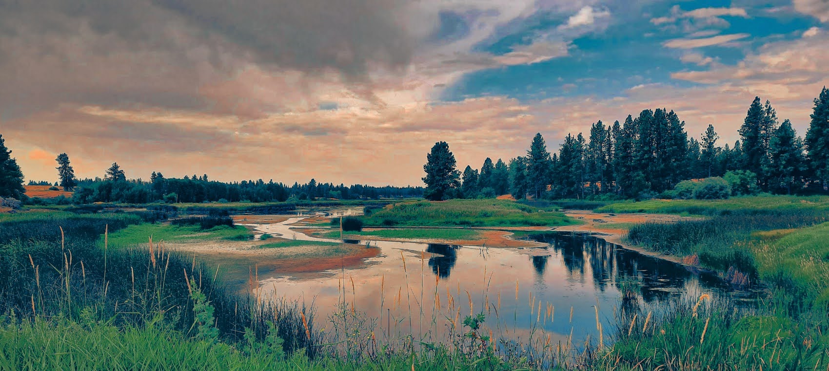
Here is an earlier color grading I did before pushing it to the max.

Color grading is prevalent in cinematography. The most common technique is to enhance depth of an image by pushing shadows towards blue and highlights towards yellows. Other color harmonies work with Orange and Teal or Red and Green.
I often struggle to explain how a digital photograph could be considered hand-made but I think when you take an image beyond it’s starting point into the realm of personal emotion you are indeed making a unique piece of art.
This image was taken on my cell phone while taking a walk at Turnbull National Wildlife Refuge. I pushed the image to the limits and yet I felt an emotional satisfaction with the end result.

