One of the interesting things about cameras is how each era of technology effects the look and feel of the image. As photographic technology has evolved it has added to the lexicon of emotional expressions that an image can make based upon subtle variations of hue, saturation, luminosity, and grain or pixel patterns.
Yesterday I was visiting a friend of mine who has created a beautiful portfolio of images of old barns in the Palouse. He has been asking me to teach him contemporary digital workflow using Adobe Lightroom and Photoshop. When I asked to see some of his work I was blown away and wondered why he thought he needed any of my help. I asked him to show me how he went about processing his images in his digital darkroom. He walked me through his process and I was suddenly reminded of the volume of Nix Collection image presets and adjustments. Essentially what he was doing was bypassing traditional photo editing software and using these plugins that had been made available for free back in 2012. As we went through his workflow I remembered that I had those same presets downloaded on one of my older computers.
I have largely ignored these presets in favor of more direct and deliberate approaches to my editing as opposed to applying a preset recipe to my images. As I watched Randy work I was beginning to change my mind about these tools. I began to see these additional tools like playing a pipe organ with all the different choices of ranks and keys to play the music in.
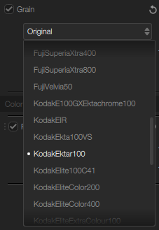
This afternoon I decided to reinstall the Nik Collection on my current workstation and do some experimenting. I thought it would be interested to play with an older image that I had actually photographed on 4×5 color film back in 2004. One of the features of these presets is the ability to emulate the look of traditional color and black and white film stock. In this case I had started off with a scan of original film and now I was seeing what subtle emotions I could draw out of the image by applying additional adjustments to create film grain and color grading that looked like other film stocks.
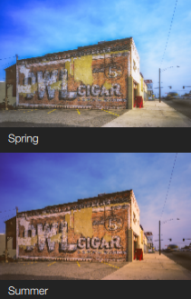
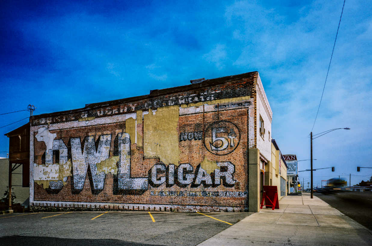
In many ways this is similar to the work I was doing last month on color grading an image to move it beyond a faithful representation of a subject into a more expressive and evocative image. I spent half an hour exploring different interpretations of my original image of what are known as ghost signs.
I made this image as part of a project I started after I had broken my left ankle and was not able to hike or climb anymore. I was looking for something interesting to invest my creative energy into and noticed that Spokane had a lot of these old signs. They reminded me of the way my father had told me how wonderful Spokane was before we moved up from Los Angeles. He would tell me about all the wonderful shops he remembered such as Grahams Office Supply where their motto was If it’s made of paper we have it!
By the time we moved to Spokane most of what he had bragged about was gone and Spokane seemed like a depressed little town. The ghost signs offered a glimpse into the more interesting past from a different era and I began photographing in earnest as I realized that as fast as I was making the photos the signs were either being painted over or the buildings torn down. I managed to photograph over 60 signs in the downtown core area. I had an exhibition of the work during a First Friday artwalk presentation and have often been asked when I would produce a book. I am happy to report that I have recently pulled out the collection from my archive and I am in the midst of editing a new portfolio book of these images. I will share more when it is finally finished sometime later this spring.
In the meantime, this was the first image from the collection. I think the new interpretation works well and so I am glad I dusted off the pipe organ and started reworking these images. I hope you like it!
Kind Regards,
Ira